Timeline
3x 3-week Sprints September 2022 – February 2023
Objective
Chase's Security Center needed to expand in order to meet growing business needs and wasn't yet optimized to serve as a resourceful tool for it's users.
My Role
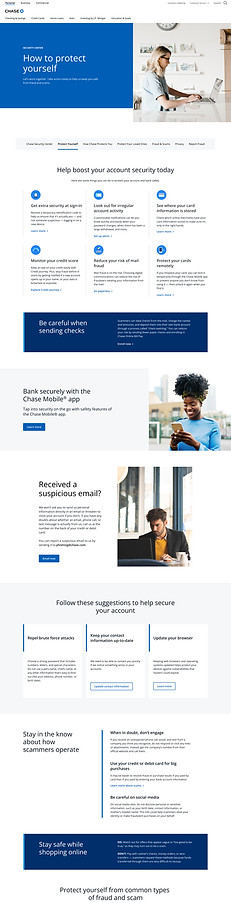
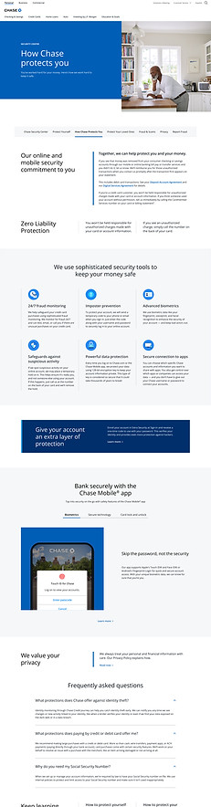
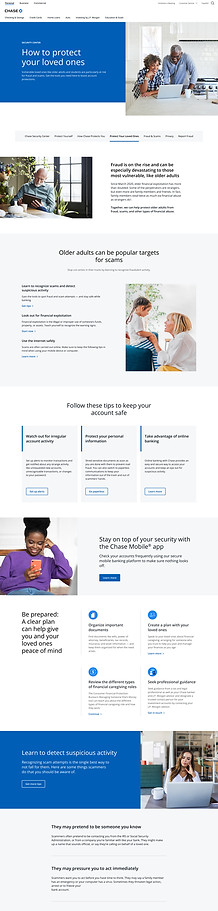
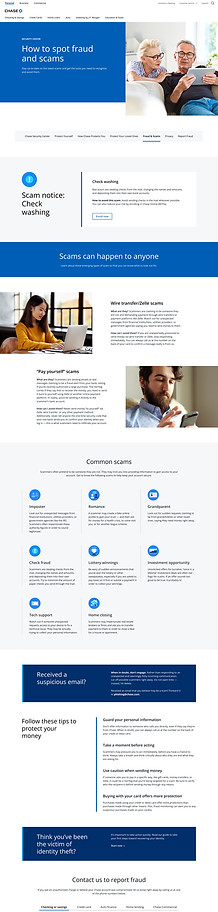
I partnered with a team of Product designers, Content Strategists and Copy-writers to build 5 pages that consolidated and streamlined Chase Security Center content in a way that would anticipate users needs and build on the customers life journey.
01 — Discovery
Auditing the current experience
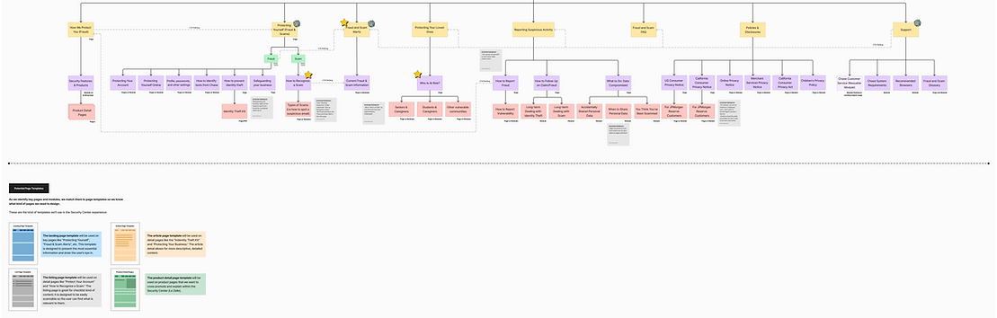
We initiated the sprint with a thorough audit of Chase's Security Center, building a visual site map to understand the ecosystem and surface early questions about how pages connected and communicated with one another. In parallel, our Data & Analytics team conducted web data, audience, and SEO analysis, and while we simultaneously audited against Chase's key financial competitors. Desktop and mobile experiences were both assessed before bringing findings to stakeholders.
02 — Synthesis
From stakeholder interviews to strategic themes
The Stakeholder conversations were able to validate our initial findings, allowing us to quickly align with their team and sharpen our direction. We synthesized notes across our existing categories, KPIs, site-level overviews, objectives, audiences, challenges, functionality allowing us to distill each of our findings into four themes that would guide future state design.
Streamline the Narrative
Build a baseline of unified storytelling around financial security with clear pathways, empathetic language, and clear content hierarchy.
Educate key audiences
Dedicate touch-points of education, equipping users with security tools to prevent fraud and reinforce trust in Chase.
Cater to EVP audiences
Establish content and messaging that is tailored to EVP (customers and care-givers) working to meet users where they are.
Provide actionable steps
Empower users to take proactive security measures through clear and actionable next steps.
03 — Ideation
User journeys and feature mapping
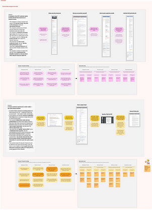
We ran journey-mapping workshops with stakeholders to surface high-level content features and identify page touch-points, which would later inform our Current Requirements Document (CRD): a living map of pages, modules, components, and functionality requirements.

04 — Design
Wireframes & iteration
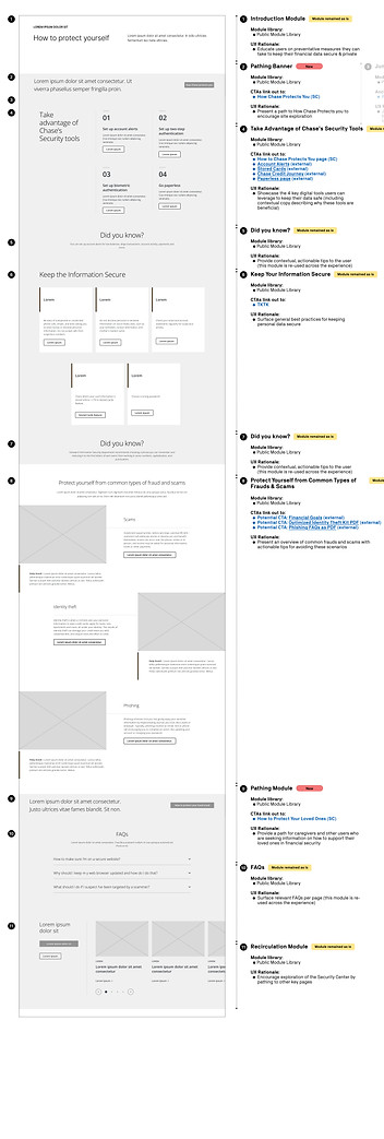
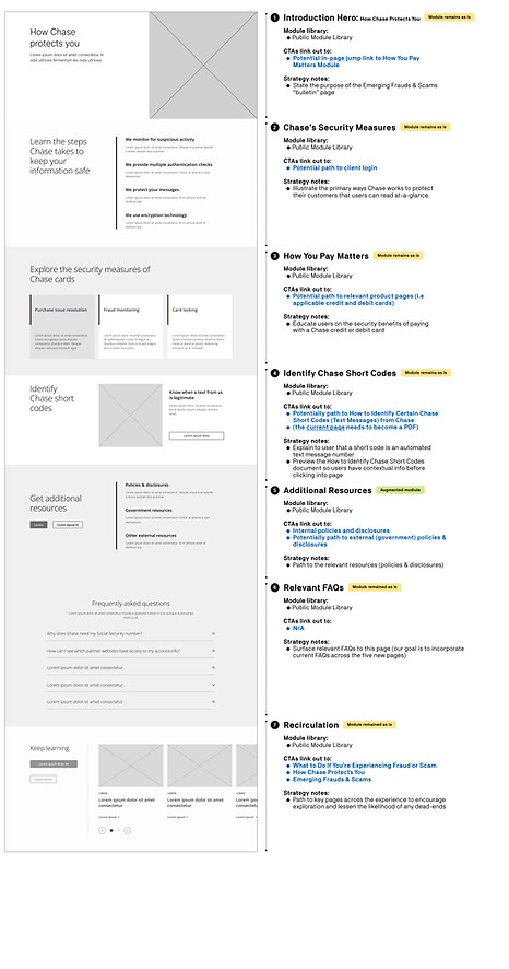
Using Chase's existing component library as a foundation, we designed augmented and net-new modules to meet identified user needs. Mid-fidelity wireframes were built alongside zone diagrams, which are descriptive page narratives that outline a components intent and content priority.
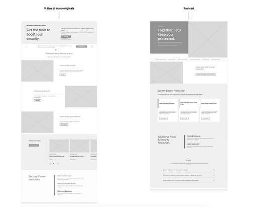
One key pivot in this work was the landing page narrative for the Security Center Landing page.
Our initial approach focused on user intent, designing clear pathways that allowed users to quickly take action on reporting fraud, protecting themselves, or getting in touch. This was structured through a set of direct entry points to streamline decision-making on entry.
However, our client emphasized the importance of showcasing the breadth of available content, having a desire to surface more topics and resources upfront.
Our final solution balanced both perspectives, prioritizing user needs at the top, while introducing a broader content layer that encourages exploration. This shift allowed the page to function as both a guided entry point and a discovery surface, supporting immediate actions without limiting visibility into the full ecosystem.
Pivoting:
05 — Delivery
Annotations and final handoff
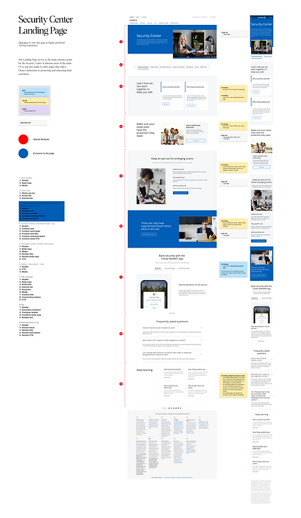
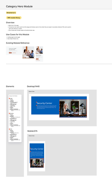
Working alongside the Interaction Designer in Figma, I led the annotation layer for each page, documenting each modules intent, cross-page relationships, and developer-facing requirements thoroughly. This ensured the strategy translated seamless into the build.
06 — Outcome
A Security Hub built for people
We delivered a cohesive Security Hub strategy grounded in user needs, balancing business goals with accessible, empathetic design. The experience creates moments of education, exploration, and seamless guidance to some of Chase's most essential tools.